|
Chapter 2: Colors and Cultures |
Exploring Color Terms as an Anthropologist
Return to MODULE PAGE Return to VIDEO LAB |
by James Stanlaw (Primary Author), Robert T. Arrigo, and David Leech Anderson
The Munsell Color Chart
"Color nomenclature theory" is a fancy way anthropologists have of referring to the study of how colors are named. One of the limitations on the early studies in color nomenclature was the lack of easy-to-use and easy-to-transport experimental devices. Of the several such arrangements available, the Munsell Color Chart (aka Munsell array, or Munsell color system) is the experimental device that has been used most frequently by anthropologists and linguists. It has been popular among researchers because it is a reliable method to use in fieldwork, it requires no special equipment (like optical instruments), and the color samples are strong, lightweight, relatively inexpensive, and readily available from a standard commercial atlas (the Munsell Book of Color). The standardized color chips of the Munsell array are similar, in a way, to the sample paint swashes found in most hardware stores, but the Munsell colors are scientifically calibrated. By now, data has been collected on over five hundred languages using the Munsell color chart, so it has become the de facto standard in the study of color.
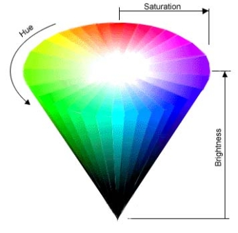
The Munsell Color Chart is a way of trying to accurately label colors based on the three dimensions of color discussed in, "The Physics of Light and Color." In that chapter, you learned that color consists of hue, brightness, and saturation. Hue is whether or not a color is a "red" or a "blue" or a "green," and so on. Saturation is how deep or vivid a color is, and brightness is the lightness or darkness of a color.
Around 1905, Albert Munsell (1858-1918), an artist and teacher, did a complex analysis of colors, which led to the creation of the Munsell Color Chart. Munsell focused not just on the physical properties of color, but on how colors "look" to the human eye. In particular, Munsell paid attention to the fact that we can more easily discriminate between brighter colors (like yellows) than we can with darker colors (browns, purples, etc.). Munsell created a comprehensive set of color chips, each separated from its neighbor by a "perceived" difference in its color. Further, an assumption was made when creating the chart that the most pure, or vivid - i.e, the most saturated - colors would be the best examples to use for comparative research.
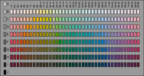
Below is a representation of the Munsell color chart. The color chips look like a color spectrum, which, in a way, is what the Munsell array is. There are 320 chips in the main body of the chart (ignore the left column of greys for the moment). Starting from the red colors on the left, the chips blend into yellows, greens, blues, purples, and pinks, and finally, end with reds again on the right.
The row on the extreme left is the dimension of greyness (we label it row zero). These chips vary from pure white on top to pure black on the bottom.
 |
| THE MUNSELL COLOR CHART |
Compared to the 3D model of the color spectrum you looked at in "The Physics of Light and Color" (reprinted, below), the hues of the Munsell chart are not continuous: there are 40 "steps," or columns, of physical chips (labeled 1 - 40), each with a different hue, as we go left to right across the table. Going from top to bottom, there are 8 rows of chips, labeled B to I. The 40 chips in each row become successively darker as we go down the chart. For instance, light yellows and whites are found in row B, and dark browns, dark purples, and blackish colors are found further down, in row I. Together, the 8 rows of brightness and the 40 columns of hue make up the 320 color chips of the array.
Unfortunately, whenever you quantize a continuum and convert a 3D space, like the color cone, into a 2D space, like the flat Munsell array, something is lost in the translation. As an example, look at a flat, 2D map of our 3D Earth - as you get further from the equator, the sizes of the continents distort (e.g. South America is about 9 times the size of Greenland, yet Greenland often looks as large as South America on flat world maps) - this problem is inherent to converting 3D objects into 2D representations. The compromises in creating the Munsell Color Chart are as follows. All of the colors that would fall in-between the color chips have been excluded, and so many colors found in the 3D cone are simply not present on the Munsell array. Further, all of the Munsell array colors are at 100% saturation. By quantizing the colors and limiting saturation to one value (100%), the finite, 2D array of Munsell color chips can represent the continuous, 3D color cone of hue, saturation, and brightness. Thus, the the Munsell Color Chart consists of the 320 most saturated colors at distinct hue and brightness levels; the less saturated chips are not present.
|
In this figure, we see the three properties of color in a 3D space. |
Basic Color Terms
Now that we have a research tool with standardized color chips of just the right hue, saturation, and brightness, you might think we're ready to begin designing and running experiments... unfortunately, there is a big problem left to tackle: there are too many names for colors! Some people have estimated that the human eye can perceive 10 million different colors, and there are thousands of color terms in English (and thousands more in other languages) that have evolved to describe those 10 million colors. Of course, this means that a single color term must describe thousands of different colors because there are far more colors than color terms. Further, of these thousands of color terms, not all are widely used, and not all are used to describe the same thing. For instance, many people do not know of or use terms like "phthalo turquois," "mauve," or "orchid" to describe the color of things. However, some people do use these terms, so researchers have to find a way to deal with them.
Many everyday color terms stem from more basic terms. For instance, we might say, "I'm looking for something that's kind of a sky-blue, but not too turqoise" color. Terms like Denim blue and olive green are referred to as secondary color terms. In fact, much of modern marketing depends on the creation of these secondary color terms. The colors of some products, such as automobiles, are given marketing names which are appealing because their secondary referents are evocative and conjure up certain emotions, like "chili pepper red" for a hot new sports car. Some color terms are unique to a given region. Saying, "That shirt is jaguar," makes sense, and jaguar is a perfectly good color term, if everyone in the village has seen a jaguar. But if villagers higher up in the mountains have never seen a jaguar, the term becomes meaningless.
Thus, a great many color terms can be given to describe a single color, and a single color term must cover thousands of colors. This is all well and fine for everyday conversation, but for a researcher trying to study color perception across cultures, a more scientific nomenclature is needed. In recognizing this, a pair of researchers, Brent Berlin and Paul Kay, who were both anthropologists and linguists, came to a critical theoretical insight that this problem could be overcome through the invention of "basic color terms."
Basic Color Terms Defined
Basic color terms were given an operational definition. A color term is called basic if it meets the following criteria:
-
Monolexemic & Unanalyzable
A basic color term must be monolexemic and unanalyzable. In other words, compound terms or color terms that have been grammatically or morphologically modified should not be thought of as basic. Thus "green" and "blue" are basic color terms, whereas "green-ish", "blue-green", and "light blue" are not.
Further, a term's meaning should not be predictable from the meaning of its parts, thus excluding words like "sunburst" and "olive green".
-
Not a Subset
A basic color term covers a range of colors that are not covered by other color terms. For example, "khaki" is a "kind of brown", and therefore it cannot be a basic color term. More obviously, "navy blue" is a subset of "blue", and thus "navy blue" is not a basic color term.
-
Wide Applicability
A basic color term will have wide applicability - it will not be restricted to describing a single referent, or a handful of things. Instead, a basic color term should exist as an abstract label that is widely applicable to many objects. Consider the English color term "blonde". Blonde fails the wide applicability test because, generally, blonde is used only to identify hair color.
-
Psychologically Salient
A basic color term is psychologically salient with respect to the number of speakers who use the term, and the frequency with which they use it. In other words, the term must be conspicuous and pervasive within a given speech community. For instance, the English color term "sepia" is disqualified from being a basic color term because it is not commonly used, and it is not well known to all speakers, and thus it fails the "psychological saliency" test.
-
Consistently Productive
A basic color term must be consistently productive using various morphemes in the language. For example, the fact that English speakers can generate (non-basic) color terms, such as "red-ish" and "green-ish", from "red" and "green", without violating grammatical or sociolinguistic de facto rules, implies that the root color terms, red and green, are basic color terms. In contrast, the questionability of "crimson-ish" confirms that "crimson" is not a basic color term.
-
Not the Name of an Object
A basic color term cannot be the name of an object. Hence, "gold", "silver", and "ash" are not basic color terms because, while they are (non-basic) color terms, they also name objects.
-
Not a Recent Foreign Loanword
A basic color term should not be a recent foreign loanword. Recent foreign loanwords are words that are additions to a given language, but which originate from outside that language and have only recently begun to be used by the given language. For instance, the Yiddish word "schmuck" was not used by English speakers until the 20th century, but now most everyone knows it is not a good thing to be thought of as a "schmuck."
-
Minimum Morphological Complexity
A basic color term should not be morphologically complex. In other words, basic color terms will be simpler words with less "parts" (e.g. "red" vs. "periwinkle").
The Experiment
Until the late 1960's, color was taken as the best - if not the only - evidence in support of a theory called, linguistic relativism. According to this theory, languages and cultures can vary in their use of color terms pretty much anyway they like. It was believed that there was no way of predicting in advance how a particular culture will "cut up" the world of color, no way of knowing in advance how many basic color terms they will have, and no way of knowing which colors those terms will name. Indeed, the variety found in color nomenclature seemed to indicate that there is nothing inherent in either human perceptual faculties or the physics of light that would compel speakers to give priority to any particular color over any other.
Using the Munsell Color Chart
Armed with the Munsell Color Chart and the notion of basic color terms, anthropologists traveled the globe to research color nomenclature. For every language encountered, the above rules were applied to identify the list of basic color terms present in that language. Next, speakers of the language, referred to as "informants" in the experiment, were presented with the Munsell Color Chart and asked to pick out the one chip that best corresponded to a particular basic color term. For example, an English informant might be instructed to, "Pick the lone color chip that best represents the color red." The color chip that the informant picked was documented as the focal color, or the best example of a color, for a given basic color term. This was done for every basic color term in the langugae. The informants were then asked to map out the range of each basic color term (e.g. circling all of the the chips that the informant thinks are "red"). This concluded the data collection process.
Since these early investigations, there have been subtle changes in the way that informants are asked to identify the color chips. For example, today most researchers present color chips to the informants one chip at a time, in a prescribed, randomized order, rather than showing them the whole chart at once. However, despite minor differences in experimental methods, researchers have found very similar results in these studies.
Experimental Results & the Virtual Anthropology Lab
So, what did the researchers find out? Do all languages have the same number of basic color terms? Are the ranges of the basic color terms the same? In this lab, you will investigate the answers to these very questions. You will travel the globe, conducting interviews with informants. You will compile data, and analyze it. You will eventually examine the data to see if you can detect any patterns in it. Then you will consider what this might teach us about how the intersts of particular cultures influence (or fail to inflence) the color concepts used by that culture.
Final Thought: Color and Cognitive Science
On a final note, we will briefly discuss the connection between Anthropology, Cognitive Science, and color nomenclature research.
Color nomenclature research is critical to cognitive science, and hopefully this will become obvious to you as we go along. However, a few points might be mentioned now. First, color nomenclature shows why anthropology is truly one of the six sub-disciplines that make up cognitive science. In this lab, we will see how "perception" and "apprehending the color world" involves a very critical cultural component, with insights that anthropology is especially equipped to offer. Second, the color problem directly addresses problems concerning the relationship between language and thought, language and culture, and language and the ostensive "out there" world. It is very difficult to get inside people's heads, and color naming is one of the few domains where subjective experience might be teased out, in a replicable fashion, from objective reality. Finally, color offers some very interesting revelations as to how (some, at least) human cognitive processes might have evolved over time. Just why do humans even have color vision? For the most part, for example, color-blind people seem to get along just fine; why was such evolutionary effort and cognitive energy devoted to the development of the complex color visual apparati that humans now have? As we explore these issues, we will learn more about the cognitive processes of the mind and brain.